
Logo design · Brandon Warrell
Logo design: Warrell Homes and the BW monogram
A logo has to work at every size it will ever be used: on a business card, in a social profile circle, on a yard sign and across the side of a car. Here are two marks I designed, how they were built, and what each one taught me about making a logo that holds up.
Warrell Homes: a real-estate logo built for a car
Warrell Homes was the real-estate business my dad ran. For a company car wrap assignment in my Photoshop class at State College of Florida (SCF coursework, Spring 2025), I designed the Warrell Homes logo first, then carried it around the whole vehicle.
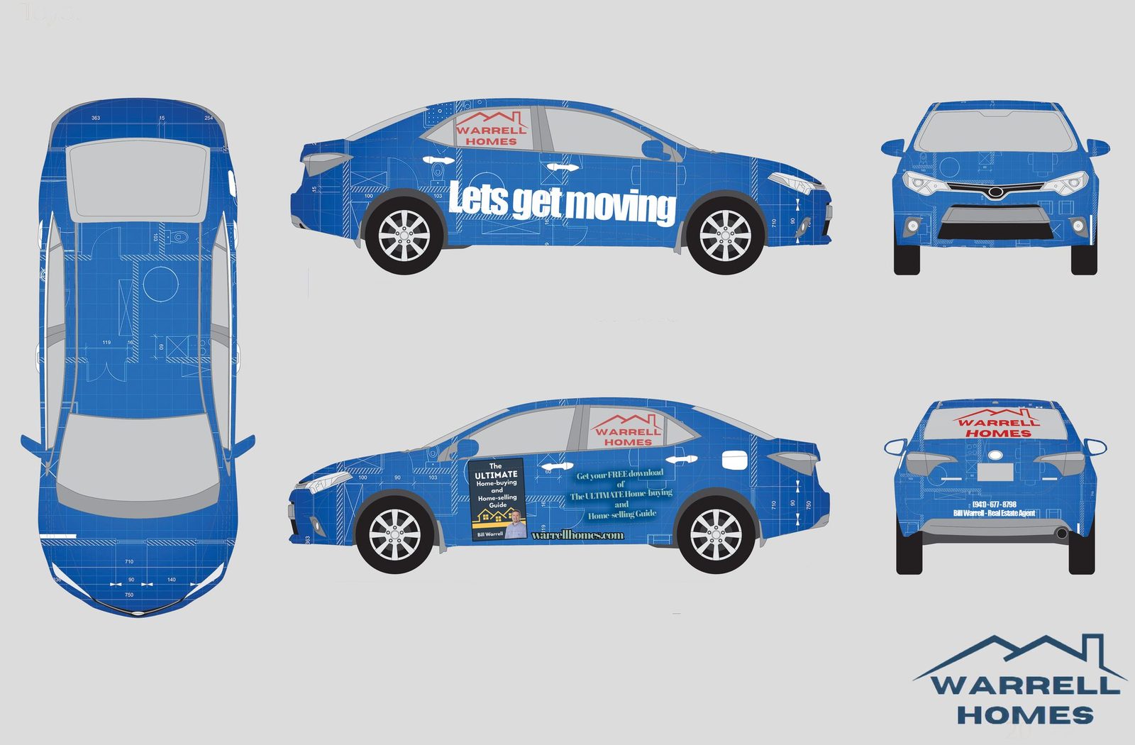
The mark is simple on purpose. A single line traces a run of rooftops above the name, set in wide, heavy capitals on two lines. The roofline tells you it's about homes before you read a word, and the stacked name stays compact enough to fit a rear window or a side window without shrinking to nothing. On the wrap it appears in red over the blue blueprint-style panels, and in navy on a light background, so the same shape works in more than one color.
Testing a logo on the real vehicle
A car is a hard place for a logo. Panels curve, doors break the artwork, and people see it from 30 feet away while it's moving. The final wrap file sits on a measured 1:20 Toyota Corolla template (4,551.6 mm long, 2,700 mm wheelbase), so I could check where the logo lands on the actual windows and panels instead of guessing. The wrap pairs the logo with the line "Let's get moving" and a free home-buying guide offer with the website.
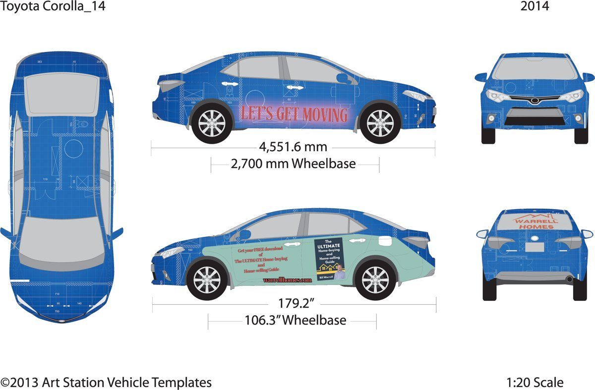
The full wrap process, including the draft I brought to critique, is on the vehicle wrap design page. One honest note: this wrap was a Photoshop-course project, so it was built in Photoshop. For a real install, a wrap or sign shop will want the logo itself as a vector file, which is how I'd deliver it for a client.
The BW monogram
My personal monogram pairs a brush-script B with a ribbon-stroke W in two blues. I drew it in Illustrator for my Typography class at SCF (coursework, Fall 2025). The B has a rough, hand-painted edge; the W is a thin, looping ribbon that sweeps through the B's lower bowl, so the two letters read as one mark instead of two letters side by side.
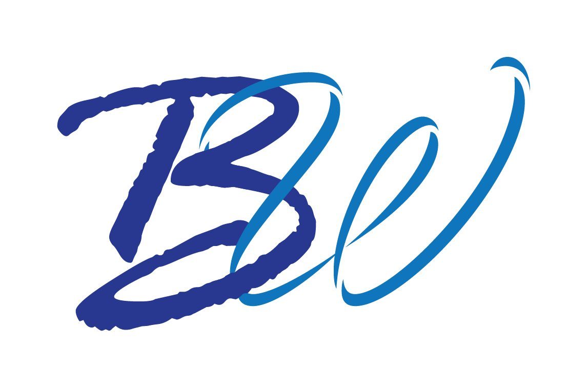
A monogram like this is built for small, square spaces: a profile picture, a favicon, a stamp on a business card. Two letters and two colors keep it readable when it's tiny.
How I approach a logo
- Start with what the business does. The Warrell Homes roofline came from the product: homes.
- Test it small and test it big. A mark that only works at poster size isn't finished.
- Check it in one color. If the shape still reads in a single flat color, it will survive embroidery, vinyl cutting and a fax-quality printout.
- Hand off the right files. Vector artwork for print and signs, plus PNG and JPG versions for the web.
If you're weighing who to hire for a logo, I wrote about freelance designers vs agencies, and about which Adobe app fits which job, including why logos belong in Illustrator.
I'm a graphic designer in Palmetto, near Bradenton and Sarasota. For a logo or a full brand set, see my work or email warrellbrandon1@gmail.com.
Vehicle template: Art Station Vehicle Templates (Toyota Corolla, ©2013).