
Photo restoration · Brandon Warrell
Photo colorization: a sepia family photo, in color
Old family photos are often the only picture anyone has of a person or a place. This project started with one of them: a sepia photo of my grandmother, taken in Papua New Guinea, reading in a chair. The assignment was to colorize it and then give her a setting that suits the moment. It was SCF coursework (Photoshop, Spring 2025), and here is how I went about it.
The brief
Take an old black-and-white or sepia family photo, colorize it, then compose the person into a scene that fits them, using only free-license or owned images. I chose the photo of my grandmother because the pose says so much on its own: head down, completely absorbed in what she is reading.
Before: the original sepia photo
This is the source, a small sepia print of a woman reading in a chair.
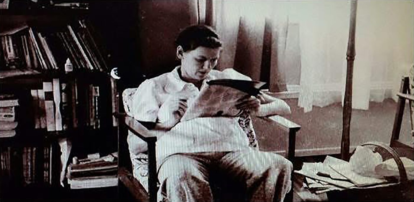
A sepia photo is a tinted black-and-white image, so every tone sits on one brown scale. Before adding color, the job is to separate the parts that will get different colors: skin, clothing, chair and background.
Colorizing by hand, one area at a time
I colorized her skin, clothing and chair separately, so each area could be adjusted without touching the others. Skin needs the most care, because a tone that is slightly off looks strange right away. I also boosted the contrast, since an old print is usually flat and the new color needs some depth to sit on.
Working area by area is slower than a one-click filter, but it gives you control over every choice, and it means the color is a decision rather than an accident.
After: placed into a library
Once she was in color, the next question was where she belongs. A reading pose suggests a library, so I set her into a free-license photo of a tall, wood-paneled library with glass-fronted shelves and a wooden staircase.
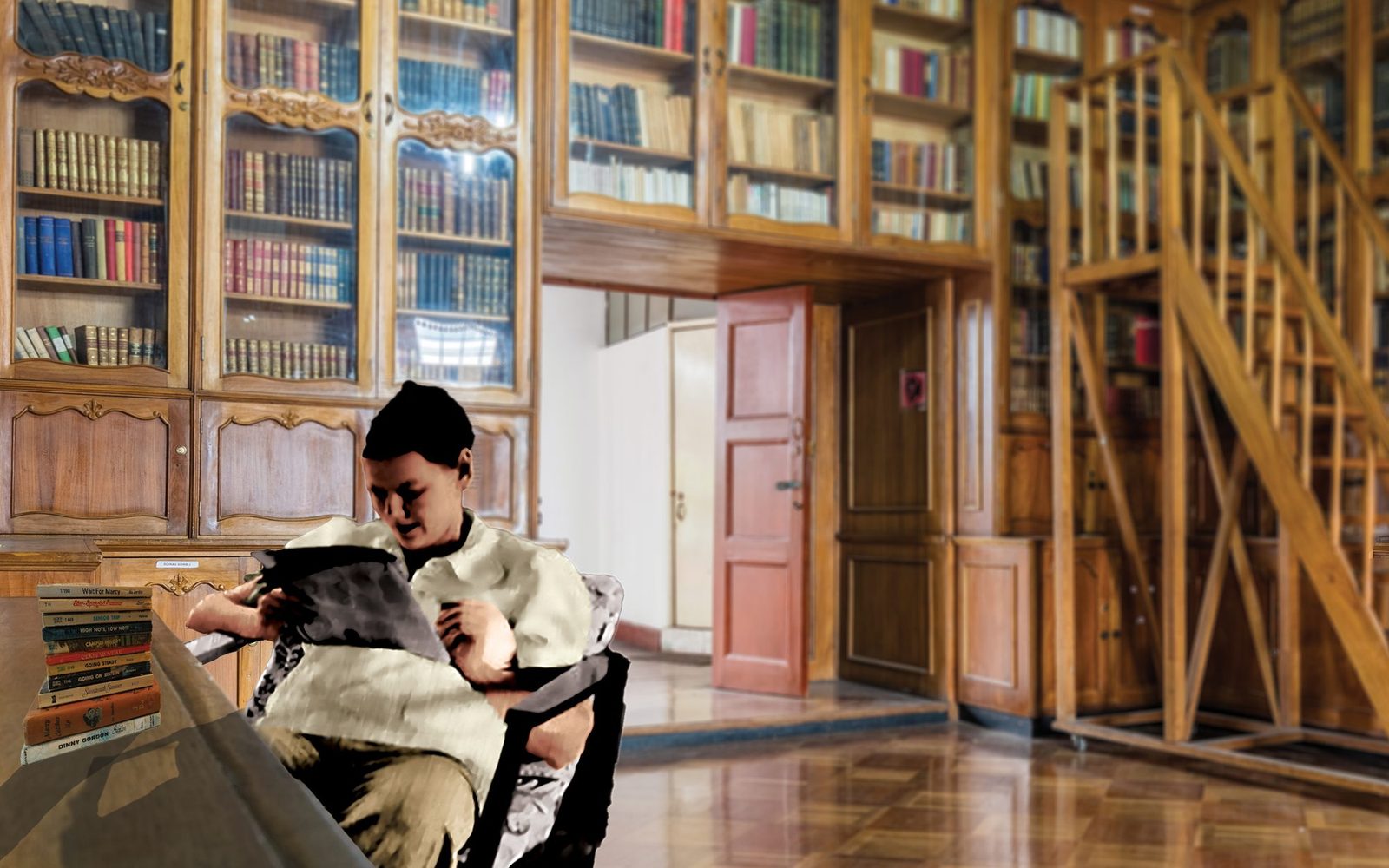
The warm wood in the background picks up the warm tones I used on her skin and clothing, which helps the two pieces feel like one picture. The finished piece is set up for a 13 × 19 in print.
Honest notes about the piece
- The library background is a free-license photo, not my own photograph.
- The colors are my own choices, not a record of what was really worn or what the chair really looked like. Any colorization is an interpretation, and I would say that to any client.
- This is class work. It is not a paid restoration job.
What I took from it
Colorizing is mostly judgment. The tools are the easy part; the harder part is deciding how far to go. For a family keepsake, I think the right answer is to keep the person recognizable and let the color support the photo instead of taking it over.
Scanning first
If you are thinking about doing the same with your own prints, the scan matters as much as the edit. I wrote a short guide on getting a clean scan before you start: how to scan old photos.
Related work
- Poster design, more Photoshop and Illustrator work from my coursework
- Graphic designer in Sarasota and Bradenton, the overview of what I do
- See the full portfolio
I'm a graphic designer based near Bradenton, FL. If you have a photo you'd like to talk about, you can reach me through the contact details on the home page.