
Guide · Brandon Warrell
Print-ready files: bleed, safe zone, color and fonts
A file that looks right on your screen can still come back from the printer wrong: a white sliver at the edge, text cut off at the trim, colors that went dull. Most of those problems are preventable with a short checklist. This is the one I use when I build posters, and I'll point to two of my own class posters as examples along the way.
One note before the details. The numbers below are common starting points, not a rule for every shop. Every printer publishes its own specs, so check theirs before you export. My article on the questions to ask your printer covers what to ask.
Start with bleed
Bleed is extra artwork that runs past the trim line, so that if the cutter shifts slightly you don't get a white edge. A common bleed is 0.125 in (1/8 in) on every side that touches the edge of the page. Any background color, photo or pattern that reaches the edge should extend into the bleed.
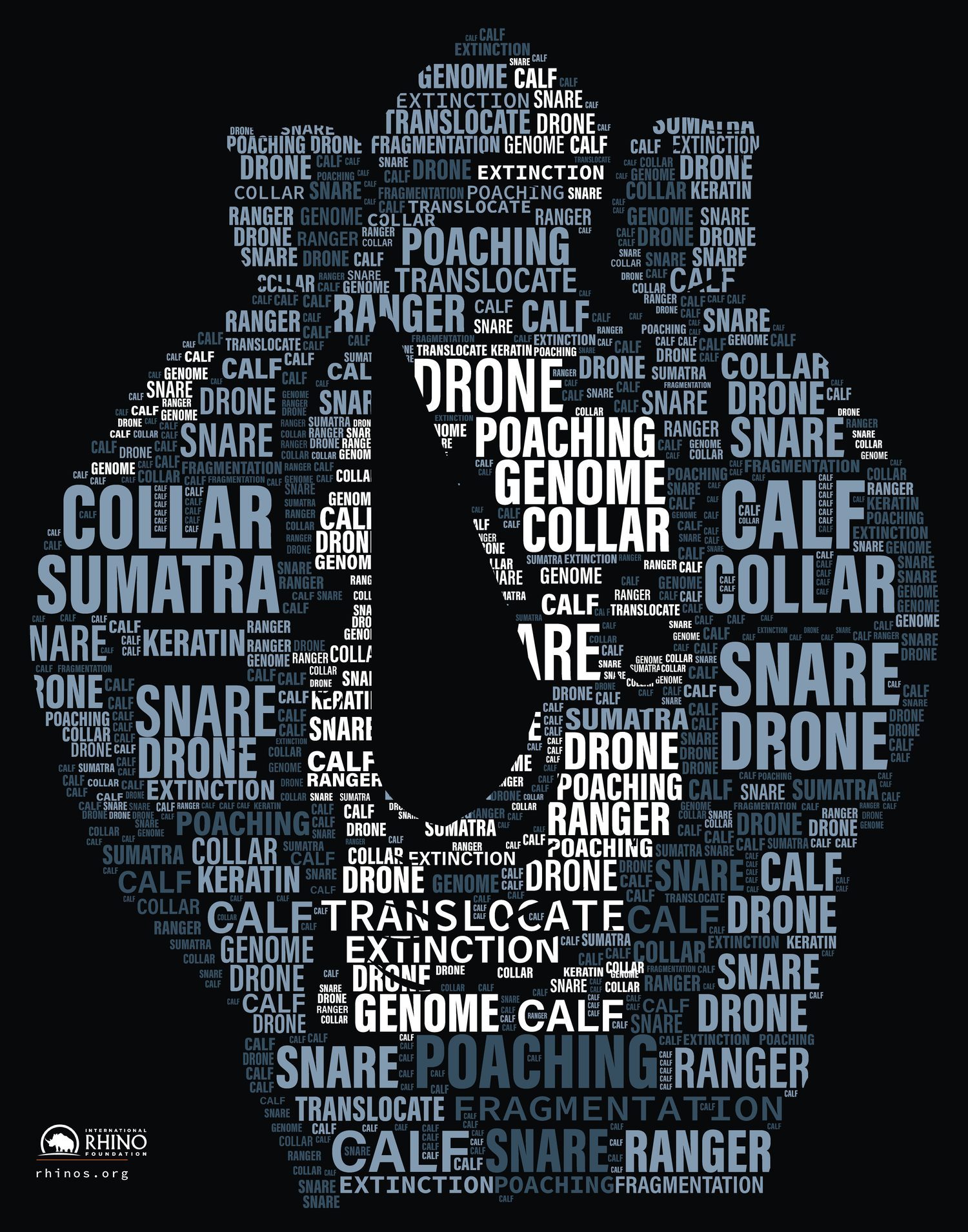
Both of my typographic posters, the rhino for the International Rhino Foundation (11 × 14 in) and the Habitat for Humanity poster (11 × 17 in), were delivered as print PDFs with 0.125 in bleed. They are SCF Typography class projects, not commissioned by either organization.
Keep important things inside the safe zone
The safe zone is the opposite of bleed: a margin inside the trim line where nothing important should sit, because trimming is never perfectly exact. A margin of about 0.125 to 0.25 in is typical. Keep logos, phone numbers, QR codes and body text well inside it. A poster can have a bold background that bleeds off the edge and still keep every word comfortably inside the safe zone.
Set the color mode: CMYK, not RGB
Screens mix red, green and blue light. Most commercial printers print with cyan, magenta, yellow and black ink. If you design in RGB, the software converts the colors for you, and the brightest, most saturated RGB colors, like glowing neon pinks, can shift when they do. It is better to see that shift yourself, while you can still adjust, than to find it on the printed sheet.
My Turntable Takeover event poster (11 × 17 in) is a 4-color process piece, set to CMYK with the U.S. Web Coated SWOP v2 profile and packaged for print in Illustrator. It is SCF coursework (Communication Design, Spring 2025) for a fictional DJ night, and the DJ photo is a stock image. Neon-style color is exactly where the CMYK check matters most.

For more on color, see Pantone vs. CMYK and, for solid black areas, rich black.
Handle fonts so they don't change
If the printer opens your file and doesn't have your font, it gets swapped for another one, and your layout can reflow. There are two safe ways around that:
- Outline the text, which turns letters into shapes. This is fast, but the text can't be edited afterward, so keep a working copy.
- Package or embed the fonts, so the fonts travel with the file (or, with a PDF, are embedded inside it).
Either way, check the exported file, not just the original.
Link or embed every image
In layout programs, images are often linked rather than stored inside the document. If a linked file is missing or moved, you get a low-resolution preview or a blank box. Use your program's package or collect function so the images travel with the document, or embed them. Then open the packaged copy once to confirm everything shows up.
Check the resolution
For photos and raster artwork, 300 pixels per inch at the final printed size is the usual target. A picture that looks sharp on screen can print soft if it has too few pixels for the size you want. Enlarging a small image in the layout does not add detail; it only stretches what is there. Large posters viewed from a distance often allow lower resolution, so ask your printer.
Export a PDF the printer can use
Most printers prefer a PDF. Many ask for a PDF/X preset, which is a print-oriented standard that embeds fonts and sets up color for reliable output. Include the bleed, turn on crop marks only if the printer wants them, and open the finished PDF to check the edges, the fonts and any QR code before you send it. A QR code is worth a scan with a phone, and I wrote about sizing them in QR code size for print.
A quick checklist
- Bleed of 0.125 in on all edges that touch the trim (or your printer's number)
- Important content inside the safe zone
- Color mode set to what the printer wants, usually CMYK
- Fonts outlined or embedded
- Images linked and packaged, or embedded, at about 300 ppi
- PDF exported with the preset the printer asked for
- The exported file opened and checked at 100 percent
Why I work this way
Most of my work is posters, so I build for print from the first step instead of fixing a layout at the end. That is also why I like asking the printer for specs before I start. If you need a poster, flyer or similar piece prepared for print, you can see more examples on my poster design page or the full portfolio.