
Social media graphics · Brandon Warrell
Social media graphics: an Instagram set and an animated banner
A social post gets about a second in someone's feed. It has to be readable at phone size, look like it belongs to the same campaign as everything else, and ask for one thing. Here are two pieces of screen-first work: a three-post Instagram set and an animated web banner, and how each one was planned.
Cirque de Paris: a three-post Instagram set
This set was a design test for a graphic design role (spec work, May 2026), not a commissioned job. The brief was one show poster plus three Instagram graphics for Cirque de Paris, a one-night show on Saturday, June 20, 2026 at the Sarasota Municipal Auditorium. It came with a reference layout and a locked four-color palette: purple, gold, hot pink and teal. I built everything in Photoshop.
Rather than make three versions of the poster, I planned the posts as a small funnel. Each one does a single job, so a follower who sees all three gets a story, and one who sees only one still knows what to do.
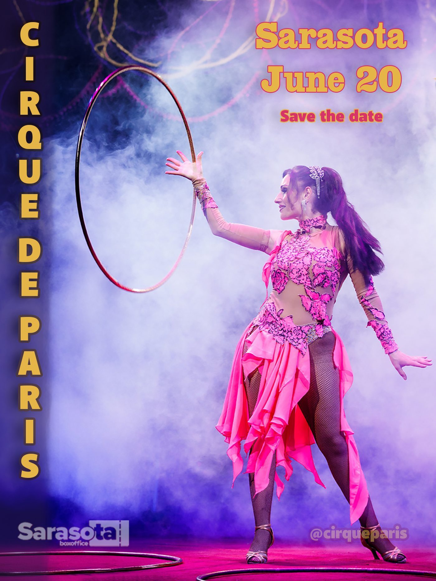
Post 1, awareness. A performer in smoke, the show name, the city and the date. No price, no offer, just "save the date."
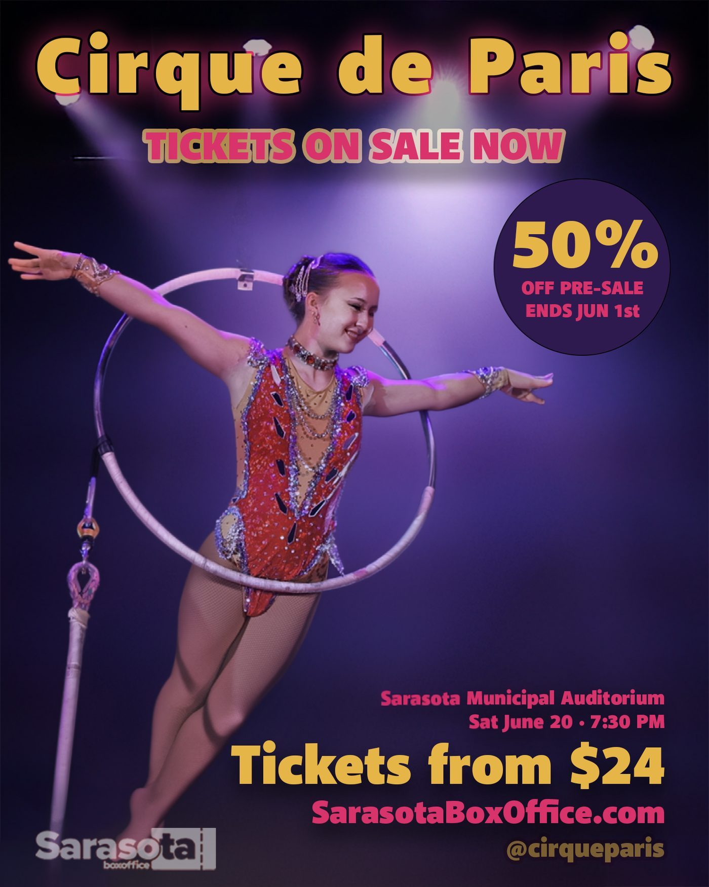
Post 2, ticket sales. Tickets on sale now, the 50%-off pre-sale and the "from $24" price, set large enough to read in the feed without tapping.
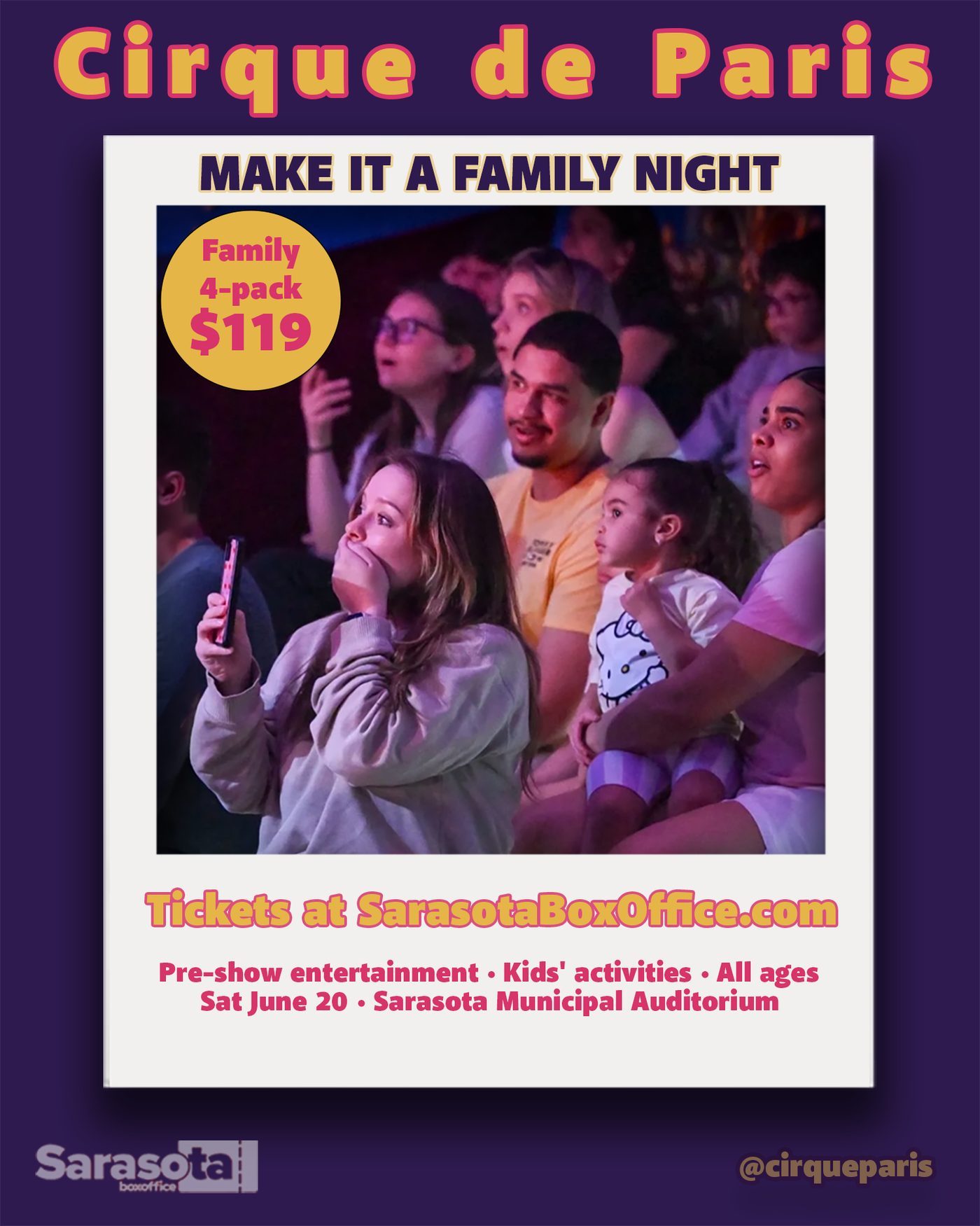
Post 3, the family offer. The audience photo shifts the focus from the performers to the people buying tickets, and the $119 four-pack is the only number on the post.
The locked palette did a lot of the work. Gold for the title, hot pink for offers and teal for information means the eye learns where to look by the second post. All performer and audience photos are Cirque de Paris promotional images; my part was the layout, type, color and the plan for the set. The matching show poster is on the poster design page.
Turntable Takeover: an animated 160 × 600 banner
Turntable Takeover is a fictional DJ night I designed for my Communication Design class at State College of Florida (SCF coursework, Spring 2025). The brief asked for an 11 × 17 in print poster first, then a 2–4 second animated web banner made in After Effects from the same artwork.
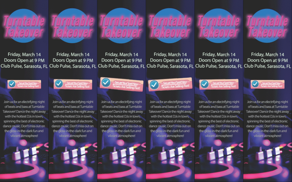
A 160 × 600 "wide skyscraper" is a tall, narrow space, so the poster couldn't just be shrunk. I restacked it top to bottom: the glowing pink title, then the date, door time and venue, then a short pitch, with the DJ decks glowing at the base. Only one thing moves: the "Secure Your Spot Now" button pulses on a two-second loop. Keeping the motion to the call to action means the eye goes straight to it, and the details stay still and easy to read. Because it reuses the poster artwork, the banner and the poster read as one campaign.
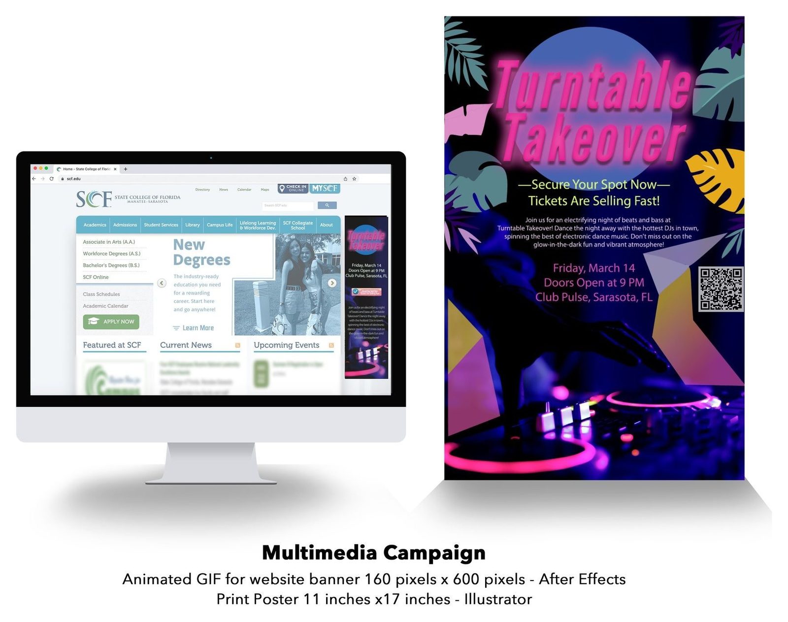
The presentation board shows the banner running on a website mockup beside the poster. The DJ photo is a stock image. The QR code was updated in 2026 to point to this portfolio; the original pointed to a placeholder address. If you need the standard ad sizes, I wrote a guide to banner ad sizes.
How I approach social graphics
- One job per post. Awareness, sale or offer. Mixing them makes every post weaker.
- Design at phone size. I check every graphic at the size it will actually be seen in the feed.
- Lock the system early. A fixed palette and type style make a set look planned, even when the posts go out days apart.
- Reuse the hero artwork. A banner, a post and a poster from the same art build recognition faster than three separate ideas.
I'm a graphic designer in Palmetto, near Bradenton and Sarasota. For social graphics, banners or a full campaign, see my work, read more about me as a graphic designer, or email warrellbrandon1@gmail.com.
Photos: Cirque de Paris promotional images (Instagram set); stock image (DJ photo).