
Article · Brandon Warrell
Visual hierarchy in graphic design: how to make people read in order
Visual hierarchy in graphic design is the order a layout gets read in, set on purpose. You control it with size, weight, color and contrast, position, and spacing. Start with three levels (headline, subhead, body), make the most important thing the strongest thing on the page, then squint at the layout to check that the order you planned is the order you actually see.
The examples below are three of my own pieces from SCF (State College of Florida) coursework, each with a different job: a long eBook, a full-page magazine ad and a square album cover.
What is visual hierarchy in graphic design?
Nielsen Norman Group describes hierarchy as organizing elements so the eye takes them in by their intended importance, and it applies the idea to print and graphics as well as webpages.
In practice, hierarchy answers one question: what should someone see first, second and last? Without an answer, every element asks for the same attention, and the reader has to do the sorting.
Which tools set the reading order?
Five levers keep coming up. Nielsen Norman Group covers scale, color and contrast, and grouping. Toptal's guide to typographic hierarchy adds weight, position and alignment, along with case.
- Size: Relative size signals rank, because big things get noticed. What counts is how much bigger one thing is than its neighbors, not its absolute size.
- Weight: A heavy head stands apart from regular body text.
- Color and contrast: Hierarchy comes from differences in value and saturation, not from the color itself. Don't rely on color alone. If everything contrasts, nothing stands out.
- Position: Where an element sits on the page, and how it lines up with the others, affects where it falls in the hierarchy.
- Spacing and grouping: Things placed close together, with white space around them, read as one group. An enclosure such as a box or a color block does the same job.
Size contrast does a lot of the work on its own. In a poster made out of words, a few large words carry the silhouette and many small ones trace its edge.
How many levels should a layout have?
Three is a good starting point. Toptal's general rule is heading, subheading and body, ranked in that order of prominence. Boise State's brand guide says much the same: at least a headline, a subheadline and body text. Its sample type settings are offered as guidelines, not rules.
Sources differ on whether three is a floor or a ceiling. Boise State treats three levels as a minimum. Nielsen Norman Group caps sizes, advising "Use no more than 3 sizes" for header, subheader and body. Toptal adds that a design may need more levels, such as captions or pull quotes. Give each one a clear job.
How does hierarchy hold a multi-page document together?
By repeating the same levels on every page, so the reader only has to learn the system once. That was the job in The World of 3D Printing, a 19-page, 12-chapter beginner's guide that I wrote and laid out in InDesign for a Typography course at SCF in Fall 2025. My instructor's feedback on the eBook called it "A particularly good example of creating text hierarchy and size contrast to organize the information clearly for your reader."
Page 16 is a clean example of how that system works.
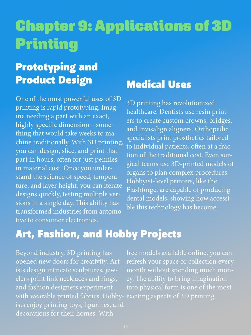
- First level: The green head, "Chapter 9: Applications of 3D Printing," is the strongest type on the page and runs over two lines.
- Second level: White subheads in a heavy sans serif name each topic: Prototyping and Product Design, Medical Uses, and Art, Fashion, and Hobby Projects.
- Third level: The body is a white serif in two columns. Changing the typeface as well as the size separates the reading text from the heads you use to find your place.
The system repeats. Chapter 6 on page 12 uses the same green head position and white subheads, then adds a fourth level: short green run-in terms such as "Tinkercad:" and "Blender:". It borrows the chapter color instead of introducing a new one.
How does an ad decide what you read second?
By size and contrast as much as position. Southern Sizzle is a full-page magazine ad for an invented fried chicken brand that I made in Illustrator for SCF Communication Design in Spring 2025. The brand and its offer were invented for the class project, so the price, QR code and web address aren't a real offer.
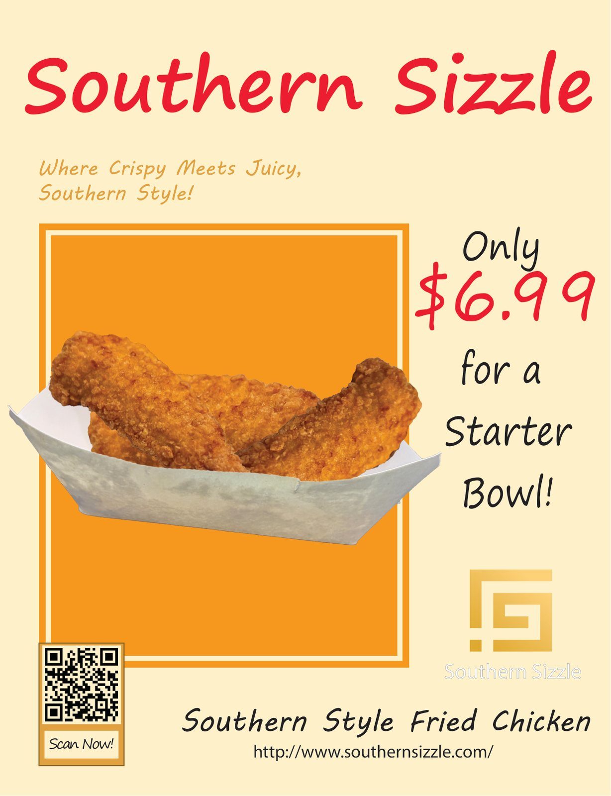
The red brand name runs the full width of the top, so it reads first. By position, the next thing is the small, pale orange tagline just under it. But small, pale type has trouble holding second place.
The "$6.99" at right pulls harder. It's the largest type after the brand name, and it shares the brand name's red, which ties the two together. The orange frame and food photo make up the largest shape on the page, so they compete for attention through sheer area. Last come the smaller details along the bottom: a QR code with a Scan Now label, the "Southern Style Fried Chicken" product line and a web address.
Size and contrast can override position. Nielsen Norman Group calls it dangerous to lower text contrast to play down less important text, because legibility drops too. A line that needs to be read second has to be strong enough to win that spot.
How does hierarchy work on a square thumbnail?
It has to survive shrinking, so the jumps between levels need to be big. Echoes of Tomorrow is a square digital cover, 4000 × 4000 px, made for streaming sites in an SCF Typography course in Fall 2025. The brief asked for typography to lead the design, and I invented both the band and the album name.

"Echoes of" is smaller and mid blue. "Tomorrow," just beneath it, is much larger and pale blue, so it wins on size and on value. The band name, "Crystal Grid," comes last because it's small and sits at lower right, not because it's faint. It's bright, which keeps it legible.
Shrink the image and watch what holds. At about 150 px wide, the title and band name both read clearly. At about 64 px, "Tomorrow" is just legible and "Crystal Grid" barely is. For more on this piece, see my album cover design page. For required dimensions and thumbnail tips, see the album cover size guide.
How do you test hierarchy before you print?
Use the squint test. Nielsen Norman Group notes that designers are taught to squint or add a slight blur to see groupings and hierarchy. You can blur a copy in an image editor and look at what still stands out.
Then ask three questions:
- Is the main focus clear?
- Which elements stand out, and should they?
- Do things that look alike actually belong together?
A blur also shows what you didn't plan. Blur a 1000 px wide copy of the eBook page about 10 px and the large green head and white subheads hold while the body turns into even blocks. The lowest subhead is weaker than the others, because the blue background fades to gray there. Do the same to the Southern Sizzle ad, and the orange block dominates, the red name and price hold, and the tagline fades. Nielsen Norman Group warns that strongly colored content can take over a layout. If what survives the blur isn't what you want read first, change the layout before it goes to print or online.
If you'd like a layout built around a clear reading order, see eBook layout for longer documents or poster design for single pieces. The FAQ has starting prices and answers to common questions.