
Illustration & lettering · Brandon Warrell
Illustration and lettering: a drop cap, a painting and pixel-built type
Some jobs need a picture or a letter that doesn't exist yet, so someone has to draw it. Here are three pieces where I made the image myself instead of placing one: an illustrated capital letter, a digital painting of Florida fish, and a headline built out of square pixels. All three are SCF coursework, and each one is partly a lesson in where a viewer's eye goes.
Drop Cap "P": less sky, more letter
A drop cap is the large capital that opens a block of text, so it has to work as a letter first and a picture second. For this Typography assignment (Fall 2025, Illustrator and Photoshop) I built a space-themed P: the letter is filled with stars, a ringed planet sits in the bowl, and a second ring circles the stem.
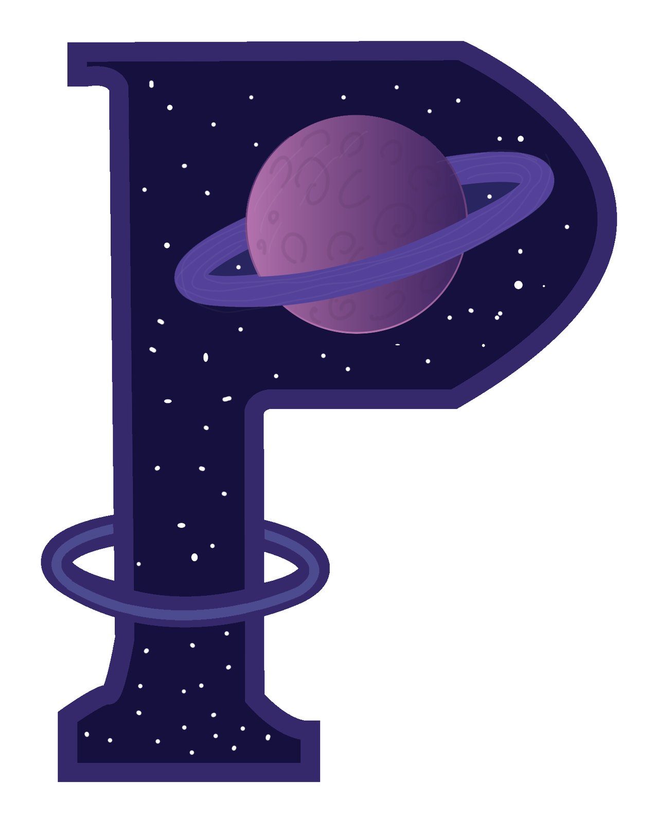
That is the revision. The first version set the letter on a starry sky above a line-drawn skyline.
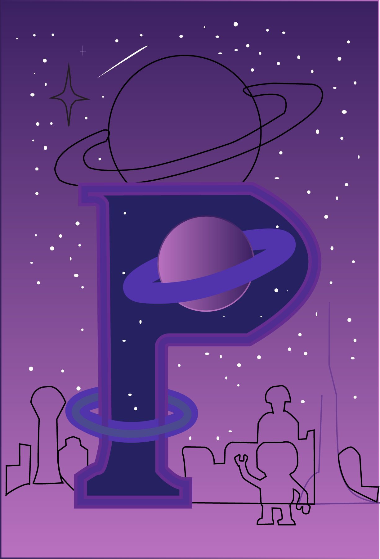
Critique noted that the busy background pulled focus from the letter, so I took the background out and let the P carry the idea on its own. The ring around the stem still ties the bottom of the letter to the planet at the top, and the shape reads as a P right away. My instructor's note on the piece: "This is a clear concept that communicates your idea well."
Florida Waters: a digital painting
This one is a digital painting of local fish moving through a sunlit underwater scene, made in Photoshop for Digital Illustration I at SCF (Summer 2025, 16:9).
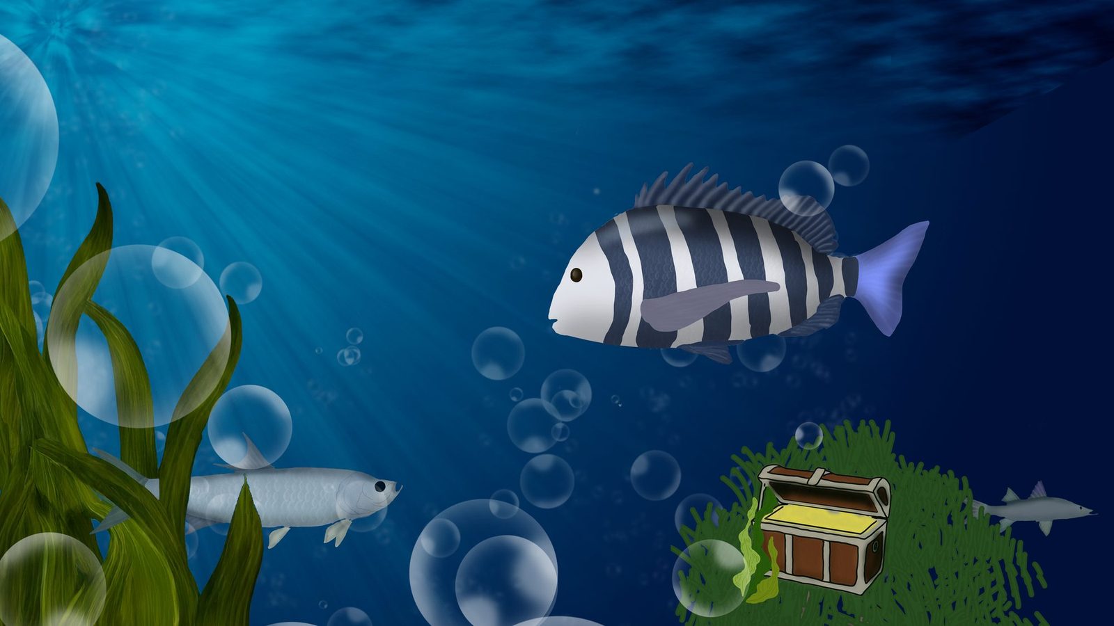
The fish are ones you'd find around here: a sheepshead, a tarpon and a snook. The striped sheepshead is the largest shape in the frame, and its dark and white bars are the strongest contrast against the deep blue, so that's where you look first. The tarpon sits lower left behind the seagrass, the snook is small in the distance, and light rays come down from the upper left. Bubbles and a small treasure chest on a green mound fill out the scene and give the eye a few things to find on a second look.
3D Printing raster type: pencil first, pixels after
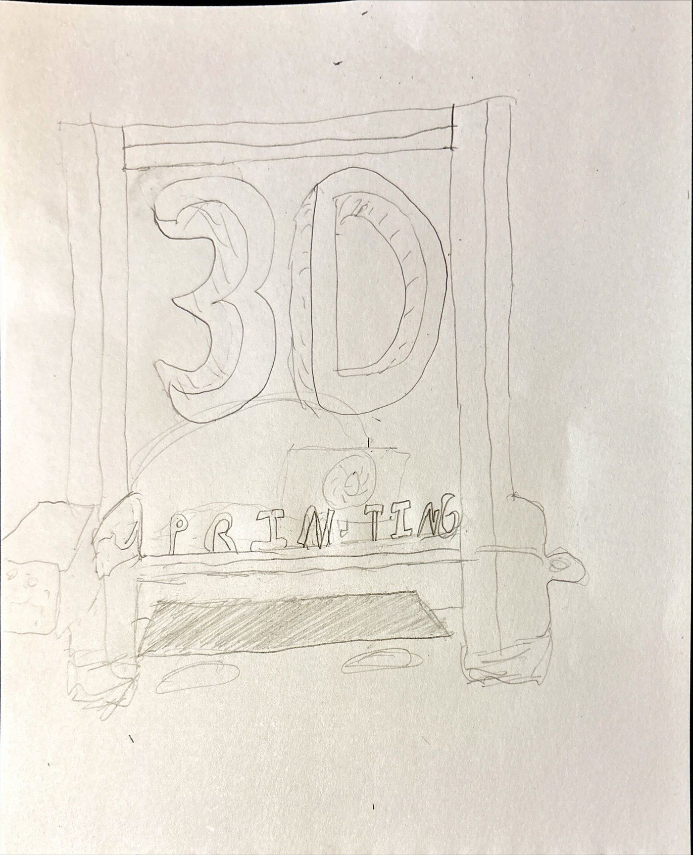
The brief for this Photoshop assignment (SCF, Spring 2025) was a raster text effect built over my own photography. I started in my sketchbook, working out where a big "3D" and a smaller "Printing" would sit inside the printer's frame.
The final builds the headline from square pixels in a cool blue and sets it over my photo of a 3D printer, framed by its enclosure.
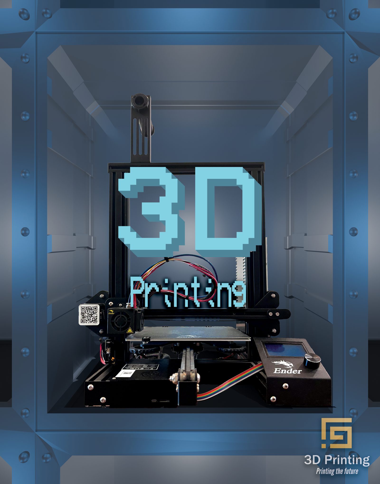
Compare the two and you can see the sketch's layout survived almost unchanged. The stepped pixel edges suit the subject too, since a 3D printer builds things up in small increments.
More on making type and images
If you want to try this kind of work yourself, I've written up a few of the methods: how to make a neon text effect in Photoshop, how to turn a photo into vector art in Illustrator, and how to build a poster where the words form the shape. The finished typographic posters are on the poster design page, and the 3D printing subject carries into my eBook layout work.