
Article · Brandon Warrell
How to make synthwave art: neon grids, city skylines and glow
To make synthwave art, start with a gradient sky, set a horizon line with one vanishing point, and draw a grid floor that runs to that point. Add a city skyline as dark, layered silhouettes along the horizon. Keep the palette to a few neon colors on a dark base, then add glow with blurred copies set to a lightening blend mode. Model a shape in 3D only when it needs real geometry, like a wireframe that has to sit in perspective.
My class piece below shows how those parts fit together. The steps are a general method, not a record of the exact settings I used.
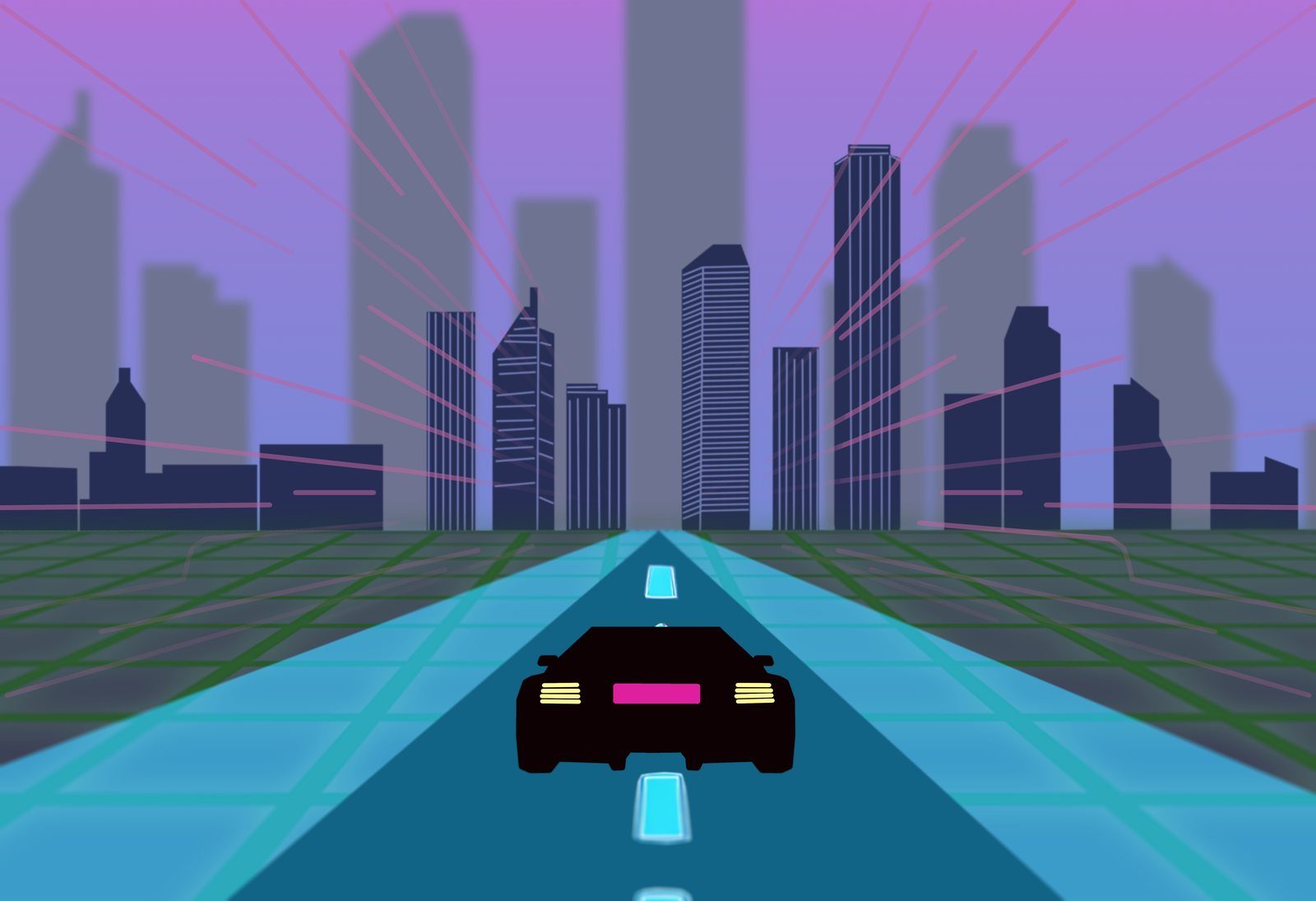
Synthwave Drive is a digital illustration of a car driving down a neon grid road toward a city skyline. I made it for my SCF Two-Dimensional Design course in Summer 2025.
What are the core elements of the synthwave look?
Synthwave started as a music genre in the mid to late 2000s, drawing on 1980s film soundtracks, composers like Vangelis and John Carpenter, and 8- and 16-bit video games. The word "outrun" comes from the 1986 arcade game Out Run and later came to mean retro 1980s visuals in general, such as magenta neon and gridlines. You'll also see the look called retrowave or outrun; the terms overlap and get used loosely.
Most synthwave images share the same small set of parts:
- a gradient sky
- a perspective grid floor running to the horizon
- a skyline or mountain range as flat silhouettes
- a limited neon palette on a dark base
- glow on the lines and lights
Sunsets, cars and empty highways are common motifs too, but you can leave them out. Synthwave Drive uses a car and a road.
How do you build the sky and the skyline?
Start with the sky, since everything else sits on it. Use a gradient that changes color from the top of the sky to the horizon. In Synthwave Drive the sky shifts from pinkish violet at the top to periwinkle blue at the horizon, so the dark skyline and the pink light lines stand out against it.
Build the skyline from simple silhouettes. Two layers work better than one:
- A back layer of taller towers, lower in contrast, closer to the sky color, and slightly blurred.
- A front layer of shorter towers in a dark, solid color with crisp edges.
You can see this in Synthwave Drive's skyline: sharp dark-navy towers with thin line details in front, and a taller, blurred gray-violet layer behind them. The blur and the faded color push the back layer away, so the city has depth without any real detail. Sit both layers on the horizon line.
How do you draw a perspective grid?
The synthwave grid is one-point perspective. One-point perspective uses lines to create the illusion of space on a flat surface; this beginning drawing lesson covers the basics. The horizon line divides the sky from the ground, and the vanishing point is where things disappear with distance. In one-point perspective, the vanishing point always sits on the horizon line.
To draw the grid:
- Draw the horizon line and place one vanishing point on it, usually at the center.
- Draw evenly spaced lines from the bottom edge of the canvas up to the vanishing point. These are the orthogonals.
- Add horizontal lines parallel to the horizon. Space them wide at the bottom and closer together as they near the horizon.
Stop the grid a little short of the horizon, or fade it out, so the lines don't pile into a solid band.
In Synthwave Drive the floor is a dark green grid, and the road down the middle is cyan, with glowing tile lines and lane dashes. Both run to the same vanishing point at the center of the horizon. Thin pink lines also radiate out from that point into the sky, which ties the sky and the ground to one center.
Which colors make an image read as synthwave?
Pick a dark base and three or four neons at most. Magenta or hot pink, cyan, purple, and sometimes a yellow or orange for the sun or the lights cover most synthwave images. The colors only look like light when the area around them is dark, so keep the grid floor and the skyline deep.
Give each color a job. In Synthwave Drive the pink is the light lines and the license plate bar, the cyan is the road, the green is the grid, and the purple is the sky. The car's taillights are pale yellow, the one warm accent in the piece.
When should you model a shape in 3D instead of drawing it?
Draw it when it's flat: gradients, silhouettes, type and grid lines all work in 2D. Model it when it needs real geometry, such as a wireframe that has to hold its edges in perspective, a shape you want to turn and view from a set angle, or a surface that isn't flat, like a rolling wave grid.
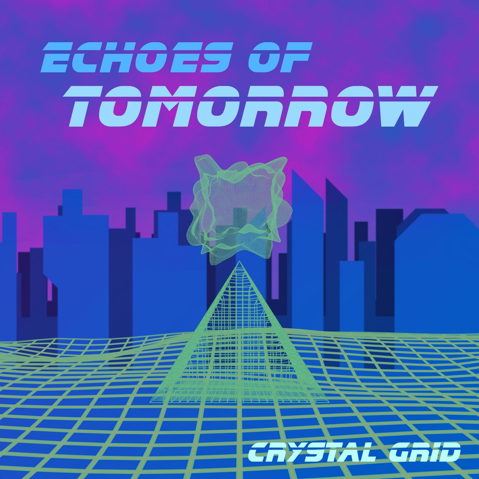
My Echoes of Tomorrow cover, an SCF Typography project from Fall 2025 for a band I invented, splits the work that way: the city skyline, cloud gradient and title stayed 2D in Photoshop, while the wireframe pyramid, glowing form and wave grid went to Blender. The album cover design page tells the full build. Illustrator vs Photoshop vs InDesign covers which app suits which part of a job.
If you go the 3D route in Blender, two features help. The Wireframe modifier turns a mesh's edges into solid strips you can light and render; the mesh needs faces for it to work, and Thickness sets how wide the strips are. Under Render Properties > Film, Transparent (in both Cycles and EEVEE) renders the background as transparent so you can composite the shape over your 2D sky. Save to a format that keeps transparency, such as PNG with Color set to RGBA in Output Properties.
How do you add the glow?
Glow is a blurred copy of the line or shape, set to a blend mode that only lightens:
- Duplicate the layer you want to glow.
- Blur the copy. A small blur gives a tight glow; a larger one gives a wide haze.
- Set the copy's blend mode to Screen or Linear Dodge (Add).
- Lower its opacity until the glow looks like light.
In both modes, black on the glow layer has no effect and lighter pixels brighten what's underneath, so the blur never darkens anything. Linear Dodge (Add) adds the two layers' values together, so it reaches white sooner than Screen. Try it for hot centers and Screen for softer spill. Adobe lists both in its Photoshop blending modes guide. Stack two copies with different blur amounts for a bright core with a soft halo. For type, my neon text in Photoshop guide walks through the full layer-style build.
How do you keep it readable at small sizes?
Keep the main shape and the title big and high in contrast, and see album cover size for how to test a cover at thumbnail size.
If you want a synthwave cover or poster for your own release or event, see my album cover design page, and the FAQ for how I work and what projects start at.