
Article · Brandon Warrell
What to put on an event flyer: a checklist that reads in one glance
An event flyer needs the event name, the day and date, a start or door time, the venue and city, the price or how to get tickets, one call to action, and a host or contact. Set the name largest, group the logistics in one block, and check every number and link before it prints.
What should an event flyer include?
- Event name. The largest words on the page.
- Day and date. Write the weekday and spell out the month: Friday, March 14. Check the weekday against a calendar for the right year.
- Start or door time. Say which one it is. Add an end time if it matters to your crowd.
- Venue and city. Add the street address if the place is hard to find.
- Price or ticket route. If it's free, say so.
- One call to action. The single thing you want the reader to do next.
- Host or contact. Who is running it and where to ask questions.
Eventbrite's flyer design guide lists the event name, time and date, venue, ticket price and call to action as the key information. The host and contact come from campus guides: the College of San Mateo lists the hosting unit among what all its flyers should include, and Hagerstown Community College asks for the sponsor and a contact.
The year is a judgment call. Hagerstown says to leave it off, while Auburn University at Montgomery (AUM) shows it in its date example. Leaving it off is fine on a flyer posted for one upcoming event. Add it if the piece will stay online or be reused.
What can you leave off?
Hagerstown asks for as few words as possible and AUM asks for less copy. Neither lists cuts item by item, so this list is practical advice, except where a source is named:
- Long sentences about the event's history. Put those on the event page.
- A second or third call to action.
- Any detail that appears twice.
- Ordinals in dates: March 14, not March 14th (Hagerstown).
- All caps in the body text (Hagerstown).
- A designer's credit, which AUM advises against, so nobody mistakes the designer for the event contact.
In what order should the details go?
Go from most to least important. Glendale Community College states that rule directly, and Hagerstown wants what, when and where to be the most prominent words, with the what largest. The order below is my recommendation, not a standard, and it is a reading order, not a size ranking: both guides rank the date and time above descriptive copy, so set the logistics block larger than the description even when it sits below it, as this poster does. The call to action comes last because it's the step after reading, not because it matters least. For the theory behind it, see visual hierarchy.
Here is that order on Turntable Takeover, an event poster I designed for a fictional DJ night in Communication Design at SCF (State College of Florida), Spring 2025. The class brief was a 4-color process event flyer, "flashy enough to pull people into the details."
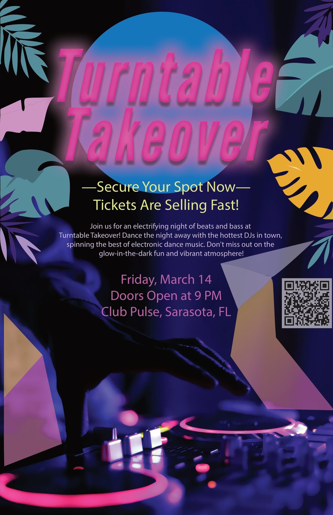
- Headline. "Turntable Takeover" is the largest type on the page, in glowing pink.
- Hook. "Secure Your Spot Now / Tickets Are Selling Fast" gives you a reason to keep reading.
- One short description. A four-line paragraph sets the mood and stops there.
- Logistics block. Date, door time and venue sit together.
- Call to action or QR code. The code sits beside the logistics, so the facts and the next step are in one place.
As class work, it also shows what a real flyer has to add. The poster has no price, no ticket route, no host or contact, and no year. The hook tells you to secure a spot, but no text says how. The QR code has no label, and since a 2026 update it points to this portfolio, not to tickets. A real flyer would fill in all of that, except possibly the year.
How should the logistics be grouped?
Put them in one block, with one fact per line, in a simple order: when, what time, where. The poster's block reads:
"Friday, March 14 / Doors Open at 9 PM / Club Pulse, Sarasota, FL"
Two rules keep it readable:
- Use a plain font. Hagerstown says the font for the event details should not be a graphic component of the flyer, so keep decorative type to the title.
- Make the block easy to see. Eventbrite suggests making key details bigger or higher in contrast.
Looking at my own poster, the logistics are a muted purple on dark, lower in contrast than the yellow-green hook. A real flyer should give those facts more contrast.
What makes a good call to action?
It names one action and makes it easy to do. Eventbrite advises sticking to a single call, and AUM describes it as the reader's next step. Start with a verb and say what happens: "Scan for tickets" or "RSVP at" plus a short address.
If a QR code is your call to action, treat it as one and not as fine print. Glendale ranks a web address among the smallest text on the page, which works for a contact link but not for the thing you most want people to use. Say what the scan does beside the code. For minimum sizes and clear space, see what size a QR code should be.
How many fonts should you use, and how much contrast?
Use two fonts at most. Hagerstown and AUM both give that limit. AUM also steers away from script. Turntable Takeover shows two styles: a heavy italic display face for the title and a plain sans for the rest.
None of these guides gives a number of colors. San Mateo asks for legible fonts and strong color contrast, and AUM reminds you to consider readers with color blindness. View the flyer in grayscale. If the date and venue fade out, raise the contrast.
Check it at real size too. Poster and flyer sizes has the dimensions and bleed for each format.
How do you proofread the details before printing?
Get other people to read it. Hagerstown puts it bluntly: "Have someone proofread your work. Always." Eventbrite suggests at least two readers who don't know the event, since print errors can be expensive to fix.
Then make your own pass:
- Check the weekday against the date. March 14 was a Friday in 2025 and a Saturday in 2026, so a reused file can be off by a day.
- Check AM or PM, and whether the time means doors or start.
- Paste the venue address into a maps app.
- Compare the price and any fees with the ticket page.
- Check the spelling of every name.
- Scan every QR code and open every link on a phone, using a printed test copy if you can.
When should the details be locked?
Lock them before design starts. Most of my projects take 2–4 business days from the time I have your details to the first finished draft, up to 3 rounds of revisions are included, and printing comes after that. Printer turnaround varies, so ask your printer before you set a date. If you're against a tight deadline, tell me up front and I can speed the process along.
Send the final, proofread wording as text. How to write a design brief covers what else to include.
If you'd like me to lay out your flyer, see poster and flyer design, starting from $75 with a fixed quote up front. The FAQ covers files, revisions and timing.