
Article · Brandon Warrell
How to make pixel (raster) text in Photoshop, from sketch to photo
To make a pixel text effect in Photoshop with an 8-bit look, sketch the layout first, then build the letters from hard-edged square cells on a small canvas, using the Pencil tool or small type set to anti-aliasing None and then rasterized. Enlarge that file with Image Size set to Nearest Neighbor (hard edges), which keeps every cell square. Then move the lettering into your photo, add a darker offset copy for depth, and color it to match the scene.
My class piece below shows the finished look. The steps are a general method, not a record of the exact tools or settings I used.
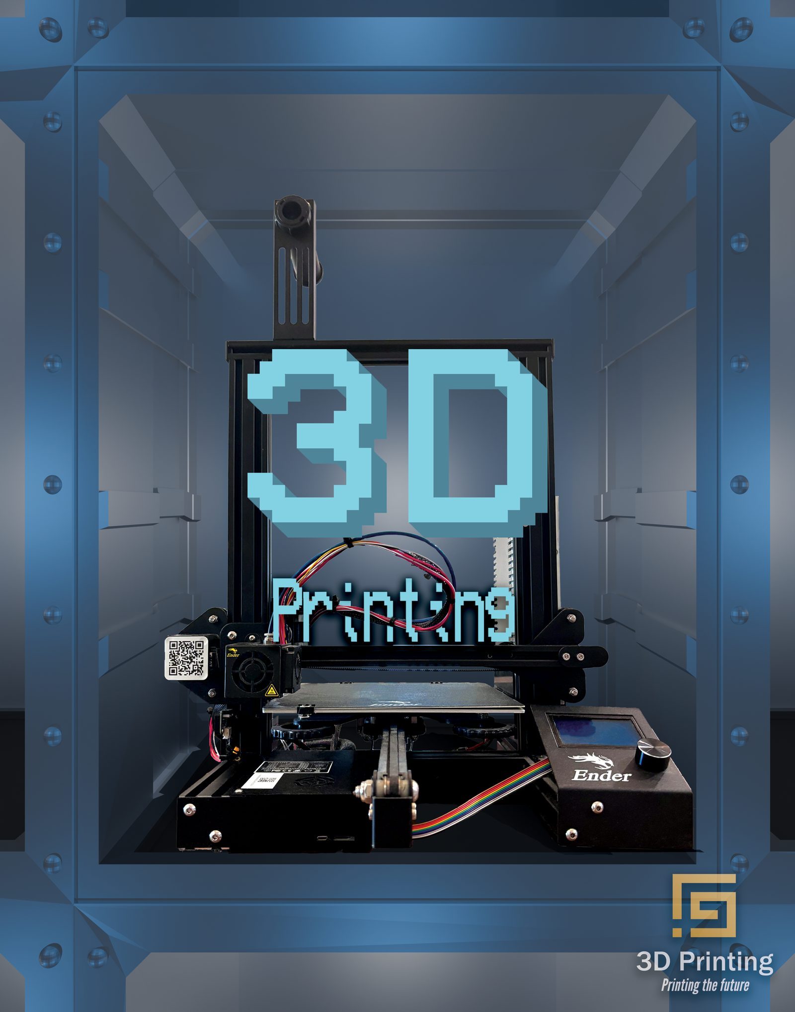
3D Printing Raster Type is SCF (State College of Florida) coursework from my Photoshop course, Spring 2025, and I was the sole designer and photographer. The brief was a raster text effect built over my own photography. The headline is assembled from square pixels in a cool blue and set over my photo of a 3D printer, framed by its enclosure.
Why sketch the layout before you start?
Pixel letters are slow to change. Each one is a fixed pattern of cells, so you can't stretch a curve or squeeze a word the way you can with live type. A small pencil sketch lets you try sizes and positions while changes are still cheap.
Draw the sketch around what will be in the photo, so you know which shapes the type has to fit inside.
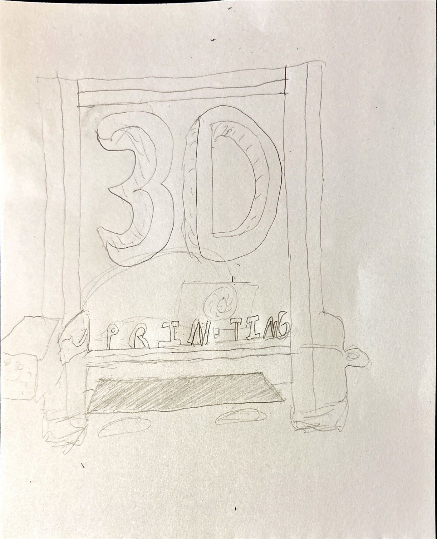
My pencil layout from pre-project planning shows a large outlined "3D" inside a printer frame, with spaced capitals "PRINTING" on a bar above the printer's bed. In the final, the curved "3D" became stepped pixels and the spaced capitals became a smaller mixed-case "Printing". The finished piece also appears on my illustration and lettering page.
How do you build letters from square pixels?
Start a separate document for the lettering and keep it small. On a small canvas, each pixel is one cell of the finished letter.
The Pencil tool
Adobe says the Brush "creates soft, blended strokes with anti-aliasing," while the Pencil tool "produces crisp, pixel-precise lines without anti-aliasing." Set a 1-pixel Pencil, zoom in and fill cells one at a time. Over 500% magnification, the pixel grid shows by default, and View > Show > Pixel Grid controls it.
For guide lines such as letter height, set up a grid under Edit > Preferences > Guides, Grid, & Slices (Photoshop > Settings on macOS), using "Gridline every" and "Subdivisions". Then choose View > Show > Grid.
Small type
Set your text small, then change its anti-aliasing to None in the Character panel or under Layer > Type. Adobe describes None as creating "hard, aliased edges."
Then keep an editable copy and choose Layer > Rasterize > Type before you enlarge it. Adobe says type layers use vector outlines instead of pixels, so live type gets redrawn at the new size instead of turning into bigger cells.
A bitmap or pixel font is an option here too; check its license before you use it.
The Mosaic filter
Adobe's filter reference says Mosaic "clumps pixels into square blocks," and you'll find it under Filter > Pixelate > Mosaic. Rasterize the type first, since you want plain pixels to clean up afterward. Rasterized text is permanently uneditable, so keep a copy. Mosaic tends to look rougher than cells you place yourself, so try small and large settings and expect some cleanup with the Pencil.
How do you scale pixel type without blurring it?
Choose Image > Image Size, enter the new Width and Height, and set Resample to Nearest Neighbor (hard edges). Adobe describes the result as "a crisp, blocky look that preserves hard edges." Don't leave Resample on Automatic, which picks a method for you.
Use whole-number multiples: 200%, 300%, 400%. At those sizes, every pixel becomes an equal square. A word 120 pixels wide at 400% becomes 480 pixels wide, with each cell 4 pixels square. At 150%, some cells come out wider than others.
Image Size resizes the whole document, which is why the lettering gets its own file. Enlarge it there, then drag or copy the layer into your photo document. Get the size right in the small file instead of scaling in the photo, because Adobe notes that with pixel layers, which it calls bitmap content, "the image becomes slightly less sharp each time you commit a transformation."
How do you add depth to blocky letters?
A darker offset copy gives flat letters thickness:
- Copy the lettering to a new layer with Ctrl+J (Command+J on macOS).
- Move the copy below the original and recolor it a darker version of the letter color with a Color Overlay layer style.
- Choose the Move tool, then nudge the copy down and to one side. An arrow key moves content 1 pixel, and Shift plus an arrow key moves it 10.
Move in whole cells. For a deeper edge, add more copies, one cell further each time. Keep the same direction for every letter.
In my piece, the "3D" has a darker blue stepped edge down and to the right, which reads as blocky depth. The smaller "Printing" stays flat.
How do you set pixel type into a photo so it belongs there?
- Shoot your own background. Pick a subject that connects to the words. I used my own photo of a 3D printer.
- Frame the type inside the subject. Look for a shape in the photo that can hold the letters, such as an opening or a frame. My "3D" sits on and within the printer's upright frame, and the printer is framed by the enclosure, so photo and type lock together.
- Take the color from the scene. Choose a hue already present in the image. My cool blue is in the same color family as the darker blue enclosure around it.
- Keep any glow light. Outer Glow "adds a glow that emanates from the outside edges." Too much of it softens the cell edges you worked to keep.
- Separate the type from busy areas. A soft Drop Shadow can help where letters cross fine detail. In my piece, you can see a soft dark halo around "Printing" where it overlaps the printer's colored wires.
If glow is the main effect you're after, my article on neon text in Photoshop goes further. If you're unsure which app a job belongs in, see Illustrator vs Photoshop vs InDesign.
What mistakes make pixel text look wrong?
- Smooth resampling. Adobe says Bilinear "may lead to softer images" and that Bicubic Smoother creates "smooth transitions with minimal jagged edges." Jagged edges are the point here, so undo, return to the small file and use Nearest Neighbor.
- Anti-aliased type. Soft edge pixels turn into off-color blocks when enlarged.
- Mixed cell sizes inside a word. Separate words can differ: the "3D" in my piece has bigger steps than "Printing". Within one word, keep one cell size.
- Too few cells. Small letters need enough cells to stay readable. Check them at final size before you add effects.
3D Printing Raster Type sits with my other projects on the work page.