
Article · Brandon Warrell
Principles of design, with real examples from three critique studies
The principles of design commonly taught in art and design courses are balance, emphasis, rhythm and movement, repetition and pattern, proportion, and unity and variety. Many lists also add contrast, hierarchy and white space. Here is how most of them look in my coursework at State College of Florida (SCF), then a closer look at three studies I made for critiques on focal point, balance and color.
What are the principles of design?
Lists vary from one source to the next. This one follows Defining the Design Principles, from the Drawing Basics course text for Coalinga College on LibreTexts:
- Balance: how objects, colors, textures and space are distributed so the piece feels stable.
- Emphasis: directing the viewer's attention to a focal point.
- Rhythm and movement: rhythm repeats elements in a regular or varied pattern, and movement is the path the eye follows.
- Repetition and pattern: using the same or similar elements throughout a composition.
- Proportion: the size, scale and visual weight of elements relative to each other.
- Unity and variety: unity is the sense that everything belongs together, and variety adds diversity and contrast.
Three more terms come up often. Nielsen Norman Group, writing mainly about apps and websites, treats contrast as its own principle: visually different elements placed together to show they are different. It also names hierarchy, which guides the eye through a design in order of importance. The Getty Museum's education pages define negative space as the area around the main objects, and they list space among the elements of art, not the principles. Graphic designers usually call this white space.
What does each principle look like in a real piece?
All of these are SCF coursework.
| Principle | Piece | What to look at |
|---|---|---|
| Balance | Window on the City | Glare and towers sit unevenly across a regular four-pane window |
| Emphasis | Pencil Burst | Six pencils aim at one empty center |
| Movement | Pencil Burst | The converging pencils carry your eye inward |
| Rhythm and repetition | Rhino word poster | Twelve conservation terms repeat at many sizes to build the animal |
| Proportion | Rhino word poster | Large and small words form the shape |
| Unity | Habitat word poster | Words such as Build, Hope and Shelter fill a roof and a three-figure family that echo Habitat's logo |
| Contrast | Rhino word poster | White and blue-gray words on a black background |
| White space | Rhino word poster | The rhino was scaled down so the silhouette has room to breathe |
Both posters came from a typography project, covered in how to make a shape out of words. Logos belong to the International Rhino Foundation and Habitat for Humanity. Class project, not commissioned by either organization.
Hierarchy gets its own page: visual hierarchy in graphic design.
How do you create a focal point without putting anything there?
Use lines that agree on a destination. A focal point is the spot a piece sends your attention to, and the textbook above notes that artists can guide the gaze there with implied lines that converge. Nothing says an object has to be waiting at the end.
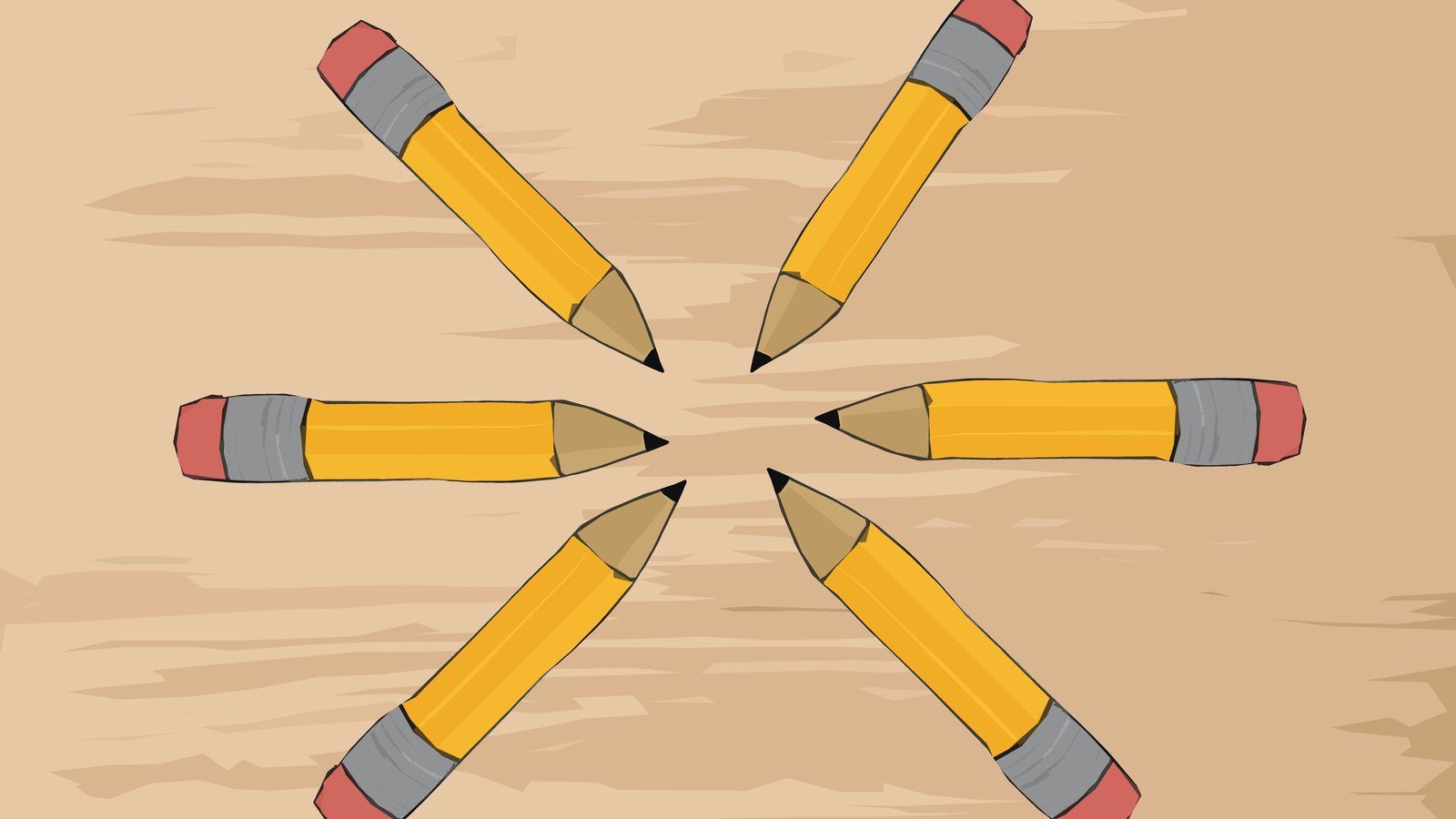
Pencil Burst, from my SCF Two-Dimensional Design course in Summer 2025, tests this. Six cartoon pencils with pink erasers radiate across a tan wood grain. Every sharpened tip stops short of the center, and only faint grain runs through the spot they all point to. All six give the same direction, so that is where your eye goes. Three of them are cropped by the frame, so they run in from outside the picture.
The same textbook advises limiting focal points so they don't compete. Pencil Burst has one, and all six pencils point to it.
What is asymmetrical balance, and why does it still feel balanced?
Asymmetrical balance uses elements that differ in weight but still look balanced. Visual weight is how heavy or light an element seems. The textbook says this approach takes careful planning.
Balanced doesn't have to mean still. The Getty's principles page links symmetry with stability and asymmetry with movement, and Nielsen Norman Group also describes asymmetry as more energetic. Expect an asymmetrical layout to feel more active than a mirrored one.
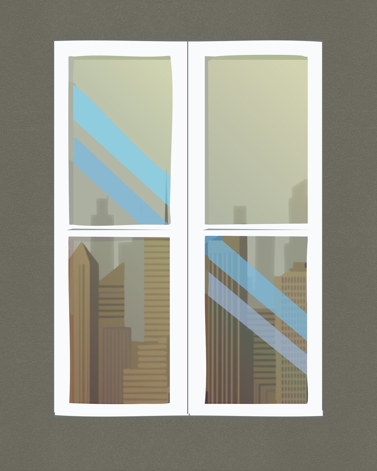
Window on the City, from the same course, keeps the window itself nearly symmetrical: a white four-pane frame centered on a gray-olive wall. The asymmetry is all inside the panes. Blue glare bands appear only in the upper-left and lower-right panes, in diagonally opposite corners. Dense brown towers fill the lower panes, while the upper panes hold mostly open, hazy sky and a few faint towers.
You can read those as counterweights: dense below against open above, and one set of glare bands answering the other across the window. No pane copies its neighbor, and the regular frame keeps them together.
How does color change the mood of the same subject?
Change the palette around one subject and it reads differently. Sailboat in Three Moods, also from that course, shows one sailboat moving through calm, storm and sunset.
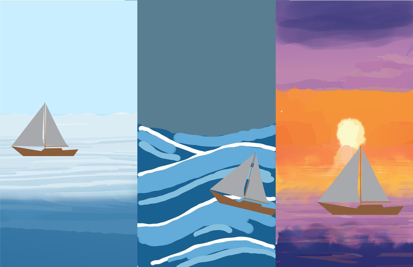
- Calm: a pale blue sky and soft horizontal water.
- Storm: a slate sky, saturated blue waves with white crests and a tilted boat.
- Sunset: purple clouds, an orange sky, a pale sun and purple water.
The boat is drawn the same way throughout, with gray sails and a brown hull, so the surroundings carry the change. It isn't a color-only test, though. The boat's position and tilt and the shape of the water change too, and color works alongside them.
This is one subject in three settings, so it can't tell you that a certain color means a certain mood. It only shows the same boat reading differently in different surroundings. A palette can also define a whole style: synthwave art depends on a limited neon palette on a dark base.
How do you use these principles on a flyer or poster?
- Point lines at the headline. Diagonal edges, arrows and rows of shapes can all aim at it. Stop them just short so they don't run through the words.
- Balance a big photo with a small, dense info block. Put the photo on one side and a tight block of date, time and place on the other. Squint at the layout to check that neither side overwhelms the other.
- Pick the palette for the mood before the layout. Write down the mood in a word or two, choose a few colors that suit it, and try them on a rough layout before you refine the details.
For the content a flyer needs before you lay it out, see the event flyer checklist.
How do these principles show up in critique?
They give everyone shared words for what is and isn't working. The three studies above were made for critiques on focal point, balance and color. My project write-ups record critique notes, revisions and instructor feedback on other SCF coursework:
- Focal point: on an illustrated drop cap, "Critique noted that the busy background pulled focus from the letter," so the revision removed the background.
- White space: after critique on the rhino poster, "the rhino was scaled to 90% so the silhouette has room to breathe," and about 400 more small words sharpened the outline.
- Hierarchy: on my eBook The World of 3D Printing (interior photos from Wikimedia Commons), instructor feedback read: "A particularly good example of creating text hierarchy and size contrast to organize the information clearly for your reader."
The full drop cap and rhino revisions are in how to give feedback to a graphic designer, which also shows how to describe the problem you see when you review a design yourself.
If you have a flyer or poster that needs this kind of thinking, start with the poster design page to see my work. Starting prices and the files you get are in the FAQ.